Pattern 112: Entrance Transition
How to design an entrance, which bring users more gently into your space
From the Book
Buildings, and especially houses, with a graceful transition between the street and the inside, are more tranquil than those which open directly off the street.
The authors discuss an argument that users tend to wear a mindset and behaviors (ie. personality) specific to existing on a street, and that existing in your building requires a shift in personality. What this pattern offers is a slight change of atmosphere, so the user can shed their street personality more easily.
This can be achieved through change in view, angle/direction sound, light, water/nature, surface material, or level (height).
Sub-patterns: Zen view (134), Garden Wall (173), Tapestry of Light and Dark (135), Trellised Walk (174), Entrance Room (130), Intimacy Gradient (127)
Applications to Software Design
I work in digital product, so the first component springing to mind is the login screen.
As users flit around the web from search engines to landing pages, they are wearing a web surfer personality, similar to the street personality. I’ll write about that personality more in a separate post about pathway patterns.
The login screen is not the Main Entrance (110). The role here is to transition the user into the product. The authors focus more on calming the user before entering the home, as opposed to a nightclub or government building, where tranquility is not necessarily the emotional goal.
I have observed SaaS products taking a few different approaches to login screens. The first is to have a simple UX for a moment of calm/focus, to get you through the login UX as fast and easily as possible. In that case, screen should feel invisible. The second is to agitate the user slightly by displaying an attractive window into what you’re about to get access to. The goal in the agitation use case is to generate excitement and inertia, which may be necessary to get the user through discovery loops or waiting times in the product before they can reach value (eg. finding something to watch, waiting for a game to load).
Use Case 1: Simplicity / Tranquility
Let’s start with the tranquil/simple use case. Here is Gmail, which is actually not the simplest layout in my collection, but at least trims big navigation elements and marketing
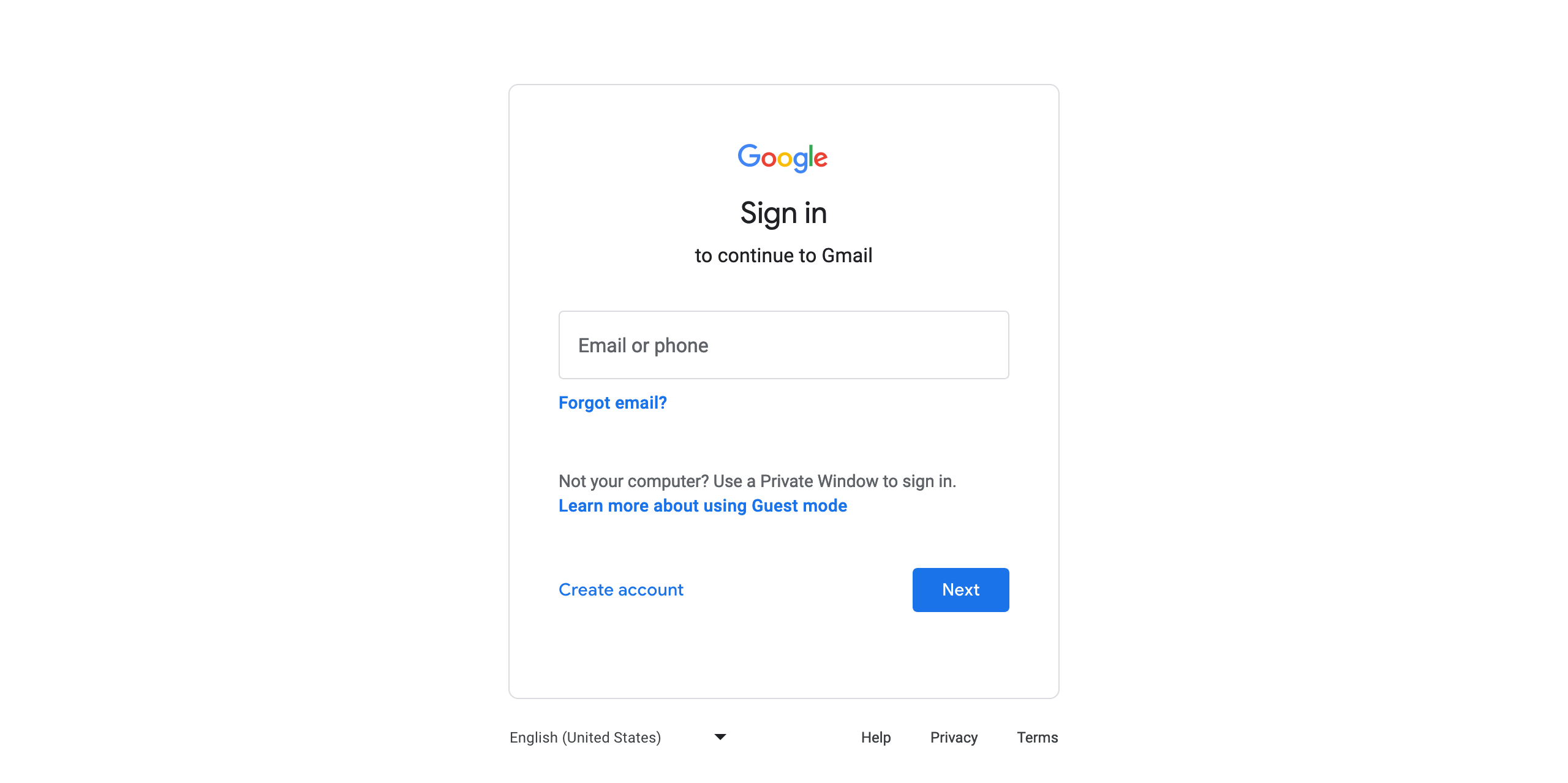
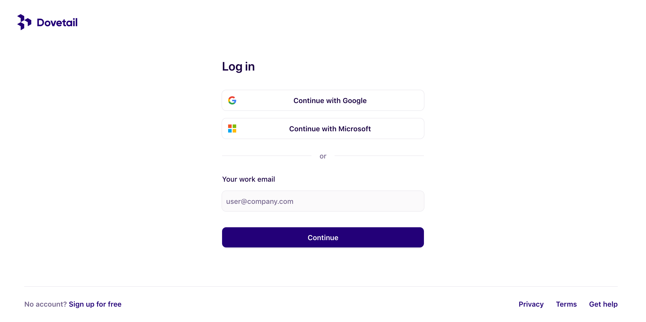
Out of the screens in this post, I think Dovetail has the most tranquil login screen. Could be the color scheme and typography combo, and comfortable use of space. Dovetail seems to have design principles intended to make the product feel like a playful garden, despite the high user effort required to get value (ie. doing your UX research properly).
Use Case 2: User Agitation
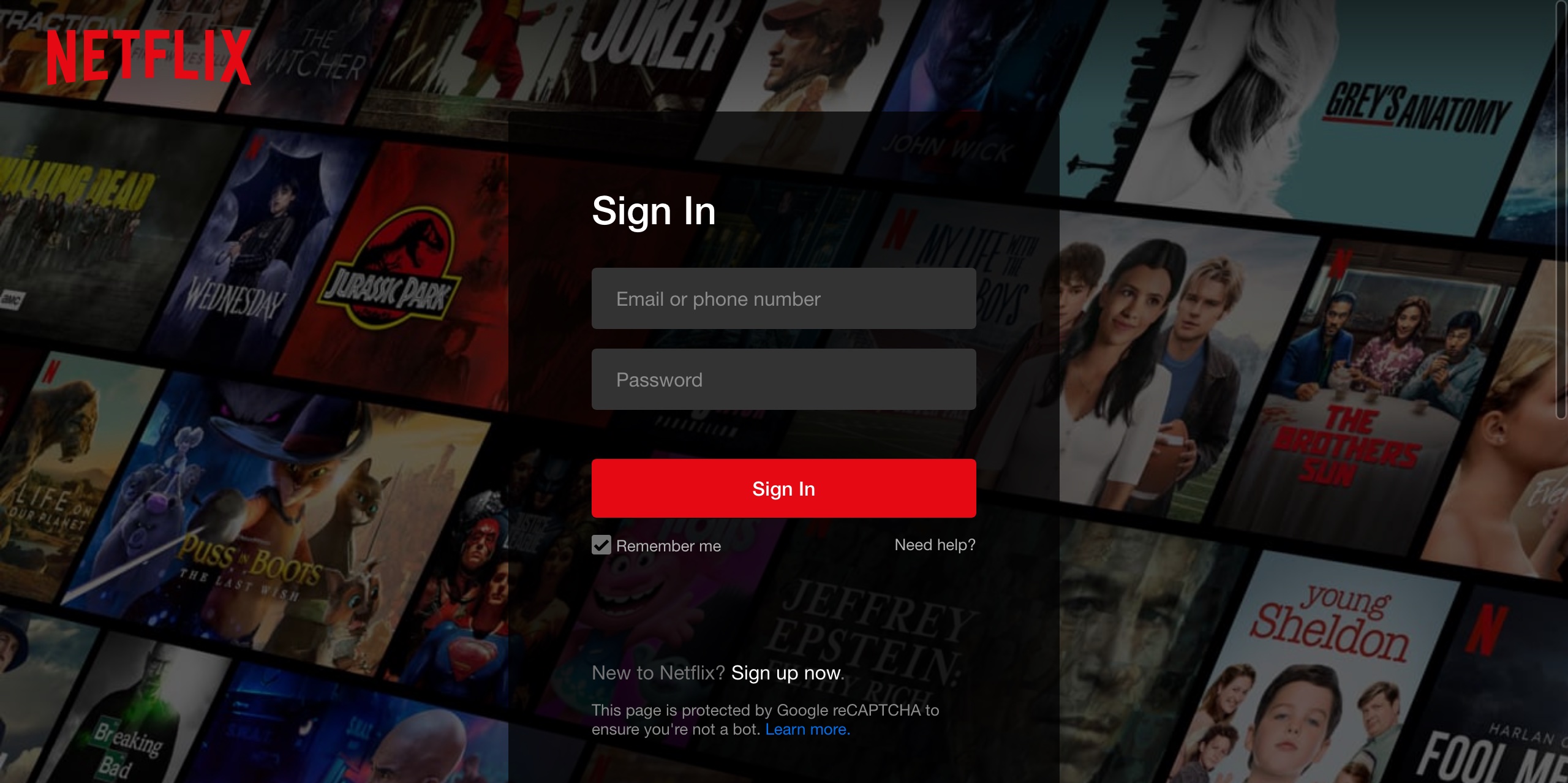
This has become a trend among video streaming services like Disney+ and Netflix shown below. The idea here is to show the user all the possibilities they’re about to gain access to, in hopes of creating inertia through the content discovery loop, or perhaps to create the sense that the user is gaining value just by having access, even if they don’t consume any content.
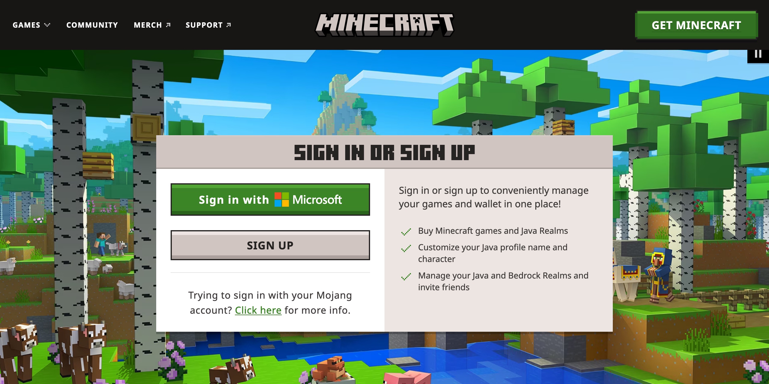
Gaming uses a similar concept, to generate inertia through potentially long loading screens. I’ll do another post at some point about waiting room design. Here is Minecraft:
Other
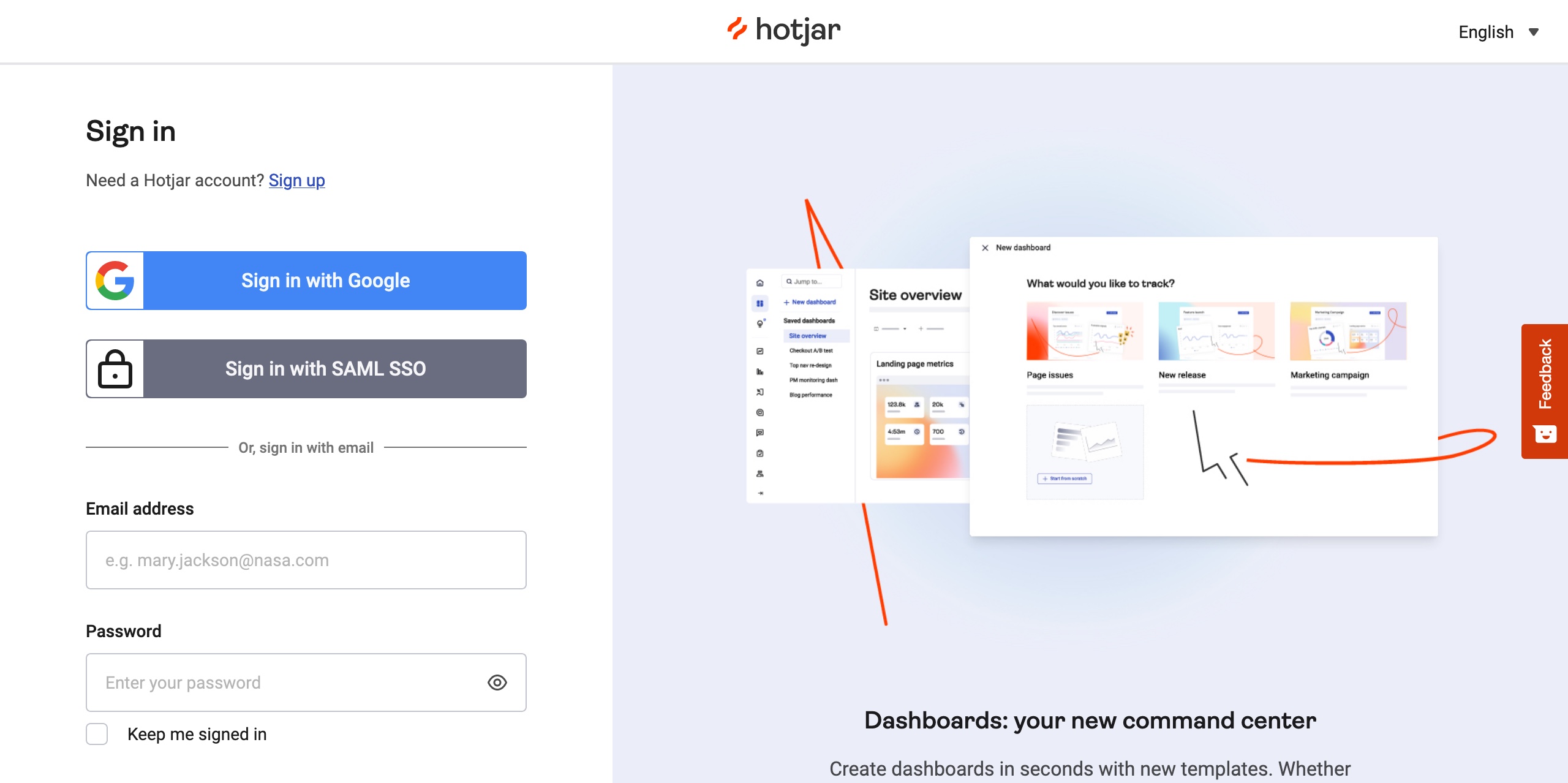
This one seems to break the patterns I’ve seen in my limited research thus far. An interesting example is Hotjar’s login screen which displays event or product marketing on the right hand side. It may be an effective means of lead generation, but may detract from the efficacy of the transition, thus potentially cheapening the feeling that this is a high quality product. There is simplicity from the removal of large navigational elements, but the split attention vibes from this don’t make it feel particularly tranquil to me.
The other consideration for digital products is security/authentication. Architecture typically deals with this in an entrance hallway, rather than an outdoor transitional space. In SaaS products, there is some necessary agitation to authenticate the user, and hopefully wake them up enough to use secure password hygiene if registering for the first time. Otherwise I’d hope users are using a password manager and the interaction cost should be low for them. Although registration is a different use case from returning user login. While we don’t necessarily have to filter everyone through the same entrance, similar to architecture, it is typically cheaper to do so. In any case that would be outside the scope of this pattern.
Link to this post