The SRK Model: Skill, Rule, Knowledge
A framework to understand and prevent use error in system designs
The SRK (Skill, Rule, Knowledge) Framework was proposed by Jens Rasmussen in the 1980’s as a branch of Ecological Interface Design. It is particularly useful for alarm and triage systems design (3 mile island is common case study when learning this framework in a Human Factors Engineering class), but is a valuable consideration in any system design.
SRK can be used to identify at which stage in the human response process a use error occurs.
- Skill = low level subconscious/motor/anthropometry.
- Rule = mid-level pattern recognition.
- Knowledge = high-level Social/Environmental/Emotional factors.
A common set of use errors might be:
- Skill: Hitting the wrong button because they are too small and too close together
- Rule: Flipping the wrong switch because its function is not labeled clearly
- Knowledge: Not informing relevant authorities about an issue because the operator is afraid they will lose their job
Examples
Skill
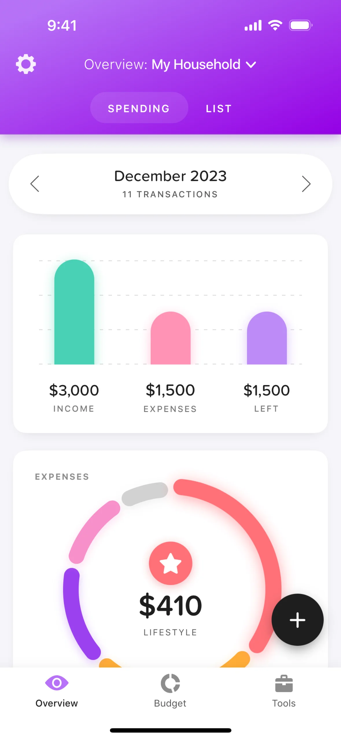
The easiest place to find skill use error on the web is in tiny mobile nav buttons that take a few tries to click, or are too far out of reach on giant modern phones.
For instance, consider the cog menu button at the top right of this app, which would be laughably out of reach for right handed users on any device larger than an iphone 5. Hopefully it doesn’t serve a critical function such that a user would regularly want to click on it. Or, even worse, imagine if the only interactive part of the dropdown up top was the chevron icon! The Web Content Accessibility Guidelines (WCAG) don’t yet have any success criteria for hand reach, but we do have success criteria for touch target size.

Rule
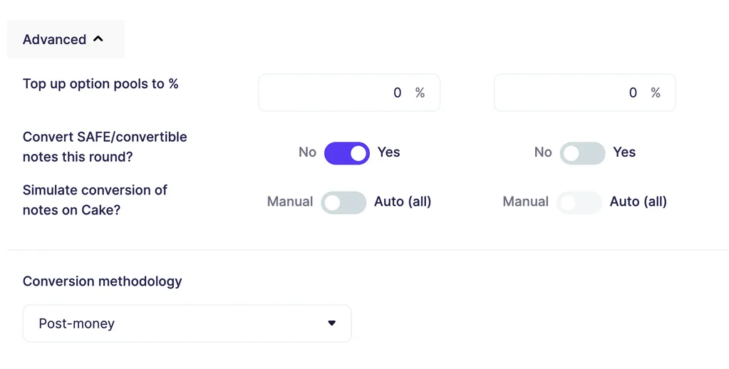
The following example of switch design is a pattern that I like in physical products like hardware synthesizers, such as the Korg Minilogue:

…but doesn’t feel intuitive in a digital UI setting. The pattern that I and most users are accustomed to is that a switch on a website represents a single idea as being on or off. The “Simulate conversion” switch tries to represent two mutually exclusive ideas, but the visual representation communicates on or off.

In contrast, I think Mixpanel handles this better with its segmented controllers (ie. toggles)

Knowledge
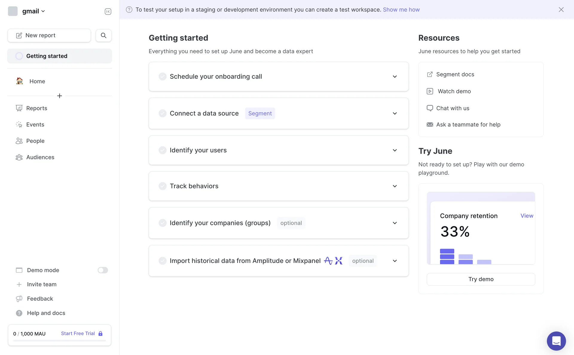
The first pattern that comes to mind is an onboarding tutorial. These get a lot of hate because I don’t think they are often matched properly for the audience and use case. If you have a really complicated system, it may be valuable to teach the rules of your system to a user who needs it to get value out of it. However, I think most web SaaS products are not so complicated that we need to teach users the rules. More often we just need to inform them what they could do with our product, and let them figure out the rules based on the UI (or they can request a more targeted tutorial once they get there).
Let’s say you are making a product that a hospital has just purchased for all of their physicians. Immediately you have a knowledge gap. If you present this system to the physicians with no context about what problems it can solve, they will have no desire to even try to learn the system’s rules.
There are probably better examples than this, but this screen does a decent job showing you what you could do with this product. They assume you would know why you’d want to do any of these tasks. Aside: I think gamification falls a little flat in a context like this because it’s not realistic that users want to use all of your features right out of the gate. I think you should let them play with the thing they care about, and if they’re ignoring part of your product, remind them after a few weeks to see if they’re intentionally ignoring it.

Visibility of the Designer’s Labor
Design for Skill use error, eg. the size, color, or distance between buttons is the most visible aspect of a designer’s job, and rarely challenges business rules or social structures. GDPR laws about button presentation in cookies banners being a notable exception to the latter. If you know a designer, this type of work is likely what you perceive them doing.
A designer’s work to create designs for Rule or Knowledge use error is less visible in the user interface. These require more research and stakeholder discussions. Outputs of the designer’s labor here is mostly in system design documents not consumed by anyone other than key stakeholders and engineers.
It is typical in online forum discussions, to see people intuitively distinguish UI Designers (making shiny buttons) from UX Designers (making systems), perhaps with a tone of defensiveness on the part of UX Designers.
Link to this post